Showing posts with label Illustrator. Show all posts

Reader's Question: How to get the sharp line in Gradient (Illustrator Tip)

29 June 2010


Well, some of the readers asked me how I got that sharp line on the gradient in my Easily Create Sticker Text and Graphic Effect in Illustrator Tutorial.


The tip for that is very simple, as you can see in the image below, in the Gradient Panel, drag a slider exactly above the other in middle to get that fine sharp line (or like web 2 style ). Just to show you, in the image below, they are a bit apart, but place the slider exactly above the other.


It doesn't matter what color you choose, you can even do it, with just 2 colors, as shown in the image below.

Hope this helps! :)

Subscribe Subscribe by RSS

READ MORE...

Create a Beautiful Abstract Background in Illustrator

06 May 2010


A hello and a smile :) to all the awesome readers. I know, I have been lagging at updating my blog but, well I'm back with a new Illustrator tutorial. :)

In this tutorial I will show you how to create a beautiful abstract background in Illustrator. By using just a simple shape creating this abstract background is pretty easy and quick. By taking advantage of some of the nifty Illustrator Effects, Transparency and blending mode you get a beautiful vector graphic in no time. So let's get started!

Open a New Document

Open a new document,  mine has a width of 18 in and a height of 12 in, but it  doesn't matter what size and color mode your document is. Though to start with I will suggest you Hide the Artboard - View>Hide Artboard, because the size of this abstract background tends to becomes very big. Of course as it is vector, you can completely re-size the background to any size you prefer after you create it.

Create a Small Rectangle Shape

Now, start by creating a small rectangle shape as shown below with Rectangle Tool(M). The rectangle that you are seeing below has a approx. width of 33px and a height of 233px. Fill it with any swatch color you wish and remember to have no stroke.


Twist It

 Select the rectangle with Selection Tool (V) and Twist (Effect > Distort and Transform > Twist) it by 60 degrees.


Transform Each

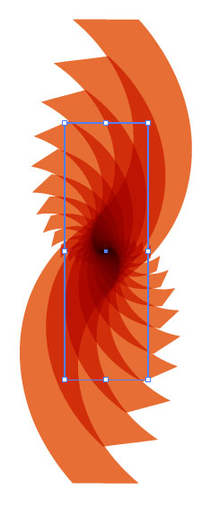
Now begins the fun! Select the shape that we just twisted as above and open Transform Each dialog box (Object >Transform > Transform Each) and add the values as 120% for Horizontal and Vertical scale and Rotate Angle to -10 degree as shown in the image below and click Copy button.


Change the Blending Mode

Select the new copied shape and change it's Blending Mode to Multiply in Transparency Palette.


Transform Again

Now, while your new shape is still selected press Ctrl/Cmd+D 17 times. Like I told you before, now your graphic has become too big, just use the Navigator Palette or Zoom Tool to zoom out and make it fit to your window. Your abstract background should now look something like as shown in the image below.


Apply Clipping Mask

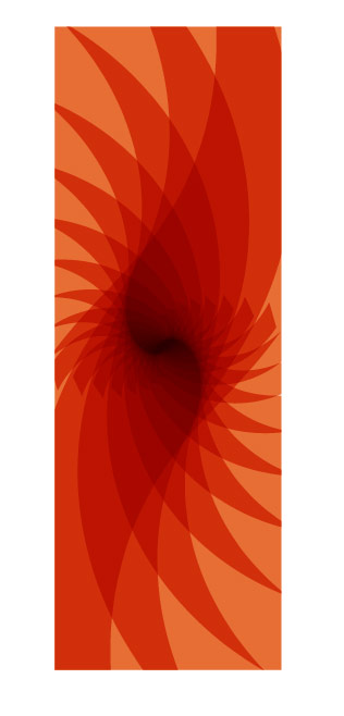
Next step is to make a Clipping Mask, for that, create a rectangle with the Rectangle Tool (M), only Stroke (any color), no fill over the image we just created as show in snapshot below. The idea of Clipping Mask is to show the area of image we want to and mask the part of image we want to hide. So with the rectangle try to cover the interesting areas of image or the area that you want to show.

Now, make a Clipping Mask, Select All, press Ctrl/Cmd + A and goto Object > Clipping Mask > Make. You can also right click and select Make Clipping Mask. After that, you should get something like as shown in the image below.
Best part of Illustrator is that, everything is editable, so if you're not happy with your mask you can go back and re-do it by selecting it and click Object > Clipping Mask > Release. You can also right click and select Release Clipping Mask.

Rotate It

Select the  shape with Selection Tool (V) and Rotate it to 90 degree by double clicking on Rotate Tool (R)  so that we have a horizontal/landscape shape.

Now, you're almost done, you just need to give some finishing touches! You can either keep the same color or change it's color with Gradient or  Solid color of your choice.

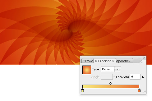
Fill it with Gradient

I selected the shape and choosed Gradient,  RGB - 248, 234, 126 and RGB - 231, 110, 52. Also, like I have said earlier, the graphic tends to become to big, but you can resize it any time by using the Scale Tool  (S), scale it uniformly. I reduced it's size to 30 %.


That should be it, your abstract background is ready, you can leave it as it is or experiment more!

Apply Pattern, Blend Mode and Twist

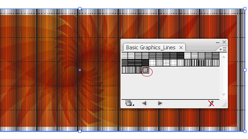
I created a another rectangle with Rectangle Too (M) over the Masked shape. And, filled it with a Pattern Swatch (and no Stroke), named "Undulating Fine Lines" , you can find it in your Swatch Palette click on the Right Menu, select Open Swatch Library > Patterns > Basic Graphics > Basic Graphic_Lines.


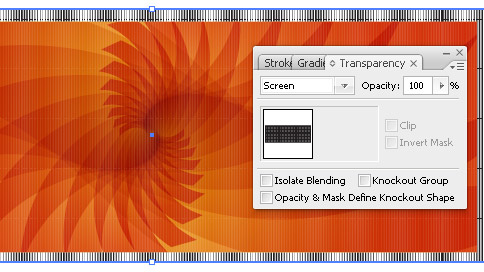
 Then I changed it's Blending Mode to Screen.


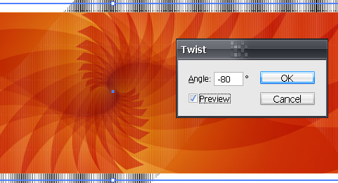
Next, I have Twist it to -80 degrees using Effect > Distort and Transform > Twist. I also rotated it a bit with Selection Tool (V).


Finally...

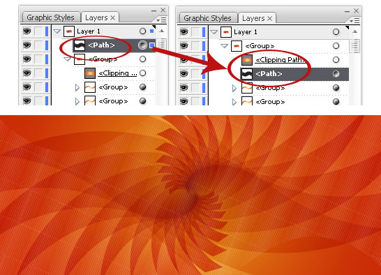
Finally, I dragged that Pattern layer beneath the layer named, Clipping Path, so that areas outside of rectangle  is masked.

And, here is my final images!
Click on the image for larger image

Hope you enjoyed the tutorial! Feel free to share the link. :)

Subscribe Get Free Updates by RSS

READ MORE...

Automatically Create Awesome Calendars in Illustrator

14 January 2010


Firstly, I want to wish all the readers of dezign Musings a very Happy and Prosperous New Year. I know I have been lagging in blog posts but, now we will start in a full-fledged.

To start with, I want to share with you this amazing free Illustrator script with which you can create a calender on a fly.This free Calender Script automates the creation of calendars in Adobe Illustrator. It has number of great features and variety of sizes in which you can create a calender.Overall you have 9 formats in which you want to create your calender.


For those who have never used Illustrator scripts, it is similar to Photoshop scripts and on the same site you will find steps on how to install new scripts.

I tried it out and it is quite easy and flexible to use. If you feel creative, you can also edit colors, fonts etc. Apart from that you can completely customize it by adding your own artwork on the calender. In the following image you can see how I have made one for the current month, January, 2010. It is such a fun and creative process. I think, I might make for all the months and maybe print it!! :)


Subscribe Get Free Updates by RSS


READ MORE...

Illustrator Tip: How to Remove White Background in Live Trace

28 November 2009

Live Trace in Adobe Illustrator is a automated and a quick way to easily convert any bitmap or raster image into vector graphic. A lot of raster images or logos have a white background and most of the time when you live trace, you only need the image with transparent background. So in this tip, I will quickly show how you can easily do away with white background using "Ignore White" command.

Just to show you a example, lets use this Shopping bag image from sxc.hu. Open a new document and place the image, File > Place in Illustrator.


Next press on the Live Trace button on the option bar and click on Tracing option dialog as shown in the image below.


In the dialog box choose the settings that you prefer,(I just choosed Photo High Fidelity for Preset and all other settings to default) now, click the checkbox ON for Ignore White as shown in the image below. Remember to check the Preview button to see the changes.


If checked, the Ignore White checkbox allows users to decide whether Illustrator shall leave/omit the areas that include white transparent and if unchecked they shall be filled in with white.

Click on the Trace button when you're done. And here is your image without the white background. Below I have added a blue gradient n the background, just to show you that now you have your vector shopping bag without the white background.


Subscribe Get Free Updates by RSS

READ MORE...

Easily Create Sticker Text and Graphic Effect in Illustrator

15 October 2009


In this tutorial, I will show you how to create sticker style effect in Adobe Illustrator. Sticker effect is quite common and I am sure, you might have seen it used in various designs. So lets get started and let me tell you, it is quite easy and you can create a sticker style text in no minutes and you can apply the same technique for any graphic illustration as well.


Step 1

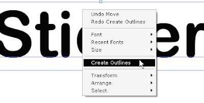
Type down the text, make sure to use a little thicker font, I used Arial Rounded MT Bold. Select the text, right click, and choose Create Outline, so that we can apply gradients to the text (I wonder why doesn't Adobe make the text go with gradients without converting the text into outline). If you don't want to use gradients in text, you may choose not to convert your text into outline.


Step 2

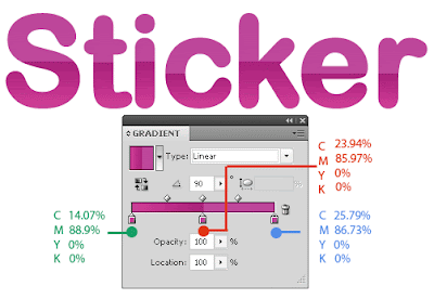
Apply gradient to text, I decided to use shiny web 2 style gradient, you can see the values of CMYK in the image below.


Step 3

With the Rectangle Tool (M) create a square or rectangle fill it with any color you like except white and select it, right click and choose Arrange > Send to Back so that you have a background below the text. You could do this at the Step 1 itself.

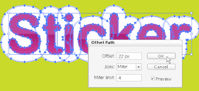
Now, select the text, Copy it (Ctrl/Comm + C) and Paste in Back (Ctrl/Comm + B). While the text you just pasted is selected, change it's Fill color to white (with no stroke) and go to Object > Path> Offset Path and choose the settings as shown in the image below or any setting that suits your text.


Note: You can also offset the path via, Effect > Path > Offset Path, which is actually a better way because later if you want to edit it, you can always do so from Appearance Panel. Also, if you have not turned your text into outline in Step 1, you will have to offset the path via Effect Menu.

Step 4

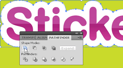
While the path you just offset in Step 3 is still selected, open your Pathfinder Panel and hit Add button.


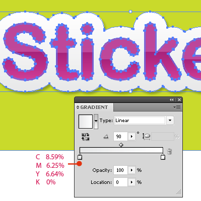
Next, if you wish you may also apply gradient to the offset path. For the Left Slider I choosed the color of gradient as shown in image below and for Right Slider the color is 0% for CMYK.


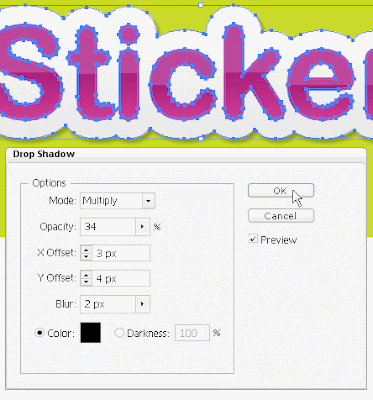
And, then apply some Drop Shadow (Effect > Stylize > Drop Shadow) to the selected path.


That's about it! Quite easy right?!


Also alternatively, instead of applying the drop shadow, you can duplicate the offset path, send it back, offset the path again to around 2 pixels, change it's fill color to black and bring down it's opacity to around 10 or 13%.


In the similar way, you can create the sticker effect on any graphic illustration or shape. But the steps are slightly different.

Take any illustration and give it a background.


Select the illustration with the Selection Tool (V), Copy it (Ctrl/Comm + C) and Paste in Back (Ctrl/Comm + B). While it is still selected, Ungroup it via Object > Ungroup (Ungroup it till it is completely ungrouped, that is till you see the Ungroup button is greyed).

Whilst it is still selected, open your Pathfinder Panel and hit Add button, as shown in the image in Step 4 above. And, change it's Fill color to white (with no stroke) and go to Object > Path> Offset Path and choose the Offset Settings that suits your illustration.

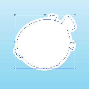
You can see your Offset Path as shown in the image below, if you click on the eye button of your main illustartion in Layer Panel.


Finally apply some Drop Shadow as mentioned above.


Subscribe!! Because You Can!! ♥


READ MORE...

Creative Process - Making an Ambigram in Illustrator

22 August 2009


Ambigrams can be quite fascinating. I saw some brilliant ambigrams and was inspired enough to try and make one myself. For those who don't know what ambigram means, here is a definition from Wikipedia:

"An ambigram is a typographical design or artform that may be read as one or more words not only in its form as presented, but also from another viewpoint, direction, or orientation. The words readable in the other viewpoint, direction or orientation may be the same or different from the original words."

To simply put, a ambigram is one where the word looks/reads same when upside down, or flips to create a whole new word.

There are many types of ambigrams, but the most basic is a rotational ambigram - visual representation of a word that when rotated 180 degrees (i.e. flipped both vertically and horizontally), spells the same word as before.

Rotational ambigram is the one that I tried to make. As it was my first try, for the words I decided to make an ambigram from my name, Sonali as I thought it is short 6 letters word and might be easy to make. Oh and if you still don't know, yes, my name is Sonali meaning golden or someone like gold. :)

Just like any designs, creating an ambigram doesn't have any set steps or rules, it depends on what you want to write. A good ambigram is one which is is legible and readable. I also think, making an ambigram is a good brain exercise as you have to think not only how you're going to write it but also how it would appear when inverted and you've to be quite creative.

I used Adobe Illustrator to make my ambigram, but you can use any app. that allows you to edit text. Also, you can sketch your ambigram with traditional methods, but I'm more of a digital person and I figured out using a font as a base would be the quickest method to make ambigram.

I don't know, how many of you would be interested, but I really wanted to share my process, so, below is a brief overview, a walk-through on how I made an ambigram of my name, Sonali.

Font:
After trying several fonts, I zeroed in on using a font named, Old English Text MT. Rather than Uppercase I decided to use lowercase alphabets. I Outlined the text and Ungroup it.


Planning:
The idea is to convert a font into an ambigram.


The word, Sonali has 6 alphabets and I figured out that "S" would have to look like "li" when rotated 180 degree. "O" should become "a" and "N" should be "N" when I rotate it to 180 degree. Here is a visual presentation of the idea.


For letters S and li:
The challenge was to convert S into li ans li into S. In the image shown below you will see the steps on how I created S and li. I used Illustrator's Selection Tool, Knife Tool for cutting the text and Transform Palette to flip the objects horizontally and vertically.


For letters o and a:
This one was easy as letters o and a are quite similar, in the image below you will see the steps.


For letter N:
This again was easy, the task was to make N look like N itself when you rotate it to 180 degree. I took only the left side of n, duplicated it and flipped it horizontally and vertically. After that I added the middle part and some frilly bits with Pen Tool.


Below you will see my final ambigram. You might have noticed above, that I have added some frilly bits to the text along the way to give it a finishing touch.


And here is the animated version so that you can see, it looks same when you rotate it.


That's about it and it's my first try with an ambigram and I think, it turned out good! I hope you enjoyed the above creative process.

So have you ever made an ambigram or are you planning t o make one? Either way it's fun to make an ambigram. Personally, I didn't follow any tutorials for this, just skimmed through some of the resources. Plus, like I have mentioned above, there are no standard steps to make an ambigram.  But you might like to check following articles and tutorials to get you started with an ambigram:

How to Make an Ambigram on Wikihow
Make an Ambigram
Advice On Learning to Create Ambigrams
How to draw ambigrams - Ambigram tutorial and walkthrough
Typographic Doppelgängers

I have also written a article on Ambigrams for Vectortuts - A Clever Collection of 40+ Inspiring Ambigrams which features some brilliant ambigrams, (logos and otherwise).

*Top image credit:ambigram.com

READ MORE...
Blog Widget by LinkWithin