
In this tutorial I will show you how to make a cool colorful text effect using a vector image. This tutorial will focus on showing you the technique, cause I think, once you know the technique you can explore and experiment it further to suit a type effect or a project that you're making. Apart from the text effect, in this tutorial I will also show you:
- how to offset the stroke or the double stroke in text/type
- how to use appearance palette and blending mode
- and will give you some tips along-the- way
Type The Text
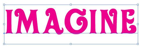
First thing first, open a New Document in Illustrator, write down some text with Type Tool (T). I wrote the word, "IMAGINE", I adjusted it's kerning a bit, so that there is enough space between each letters. Colors of fonts etc. is not much important at this stage, so choose any.Tip: Select a lil thick or broader font for this text effect. Also, keep the loose kerning between each letters, so that when we apply the offset strokes, the letters don't get mixed up.
Select a Vector Artwork/Image
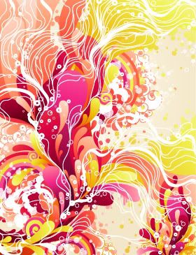
Next, select any vector image, you can use any of your own artwork or any vector image that you have or from sites like iStockphoto, Shutterstock or from the free vector resource sites like Vecteezy etc.
Also,for this text effect you can even use a raster or bitmap image as well, but I will highly recommend you to use vector image, so that our text is in pure vector format. For the purpose of this tutorial I used the image shown below from Shutterstock. I like how colorful and abstract it is.
I select the entire artwork (Ctrl/Cmd + A) with Selection Tool (V) and copied it, Edit > Copy (Ctrl/Cmd + C), then I paste it, Edit > Paste (Ctrl/Cmd + C) in my current document. Now, while the artwork is still selected, drag it and move it into Swatch Palette. You should see your entire vector artwork/image as "New Pattern Swatch" in Swatch Palette. Now, you can use this image just as how you would use a Pattern Swatch in Illustrator, but remember since it is a image, it is not a seamless pattern and cannot be used for tileable purposes. You can also use a seamless pattern swatch for his text effect but, it will look very uniform, that is why I am using a vector image, so that all he letters looks a bit different but still have some uniformity as far as word is concerned.
Now into the Text
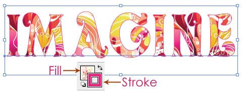
Select the text with Selection Tool (V) and apply the Pattern Swatch, that we just created in Step 2.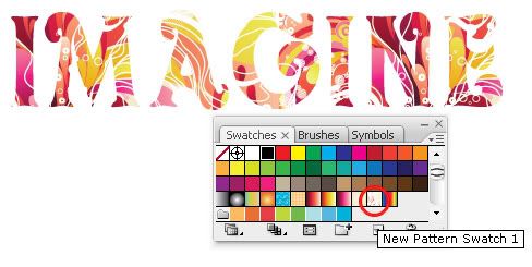
Tip: If you want some interesting part of your image/pattern to be shown, hold down the Tilde Key (~) while dragging the pattern filled text with Selection Tool (V) or rotate, scale or shear tool, at the most Selection Tool (V) will do the trick. If you want to know more about transforming Patterns, check my tutorial on Vectordiary.
Apply the Stroke to the text, by selecting the text. I applied a shade of pink (which I think I might change later and of course it is editable) with the Weight of 1pt.
Offset a New Stroke
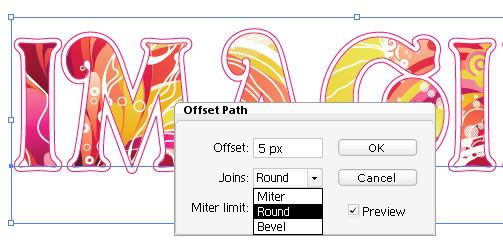
We will create a another stroke which is a bit offset or away from the first stroke that we applied above. So, now it is the time to open your Appearance Palette if it is not already opened. I think Appearance Palette is the most important palette in Illustrator and should be opened all time for all your Illustrator projects.Select the text with the Selection Tool (V) and on the Appearance Palette click on a button on Right and select Add New Stroke. Then choose the color of the Stroke, I choose same Pink as the earlier stroke. After that, goto Effect > Path > Offset Path from the Top Menu Bar. In the Offset Path Dialog Box choose the settings as you need, remember to click on Preview, so you can see the changes from different settings. I chose to Offset the Path to 5px and Rounded for Joins and Miter limit of 4.
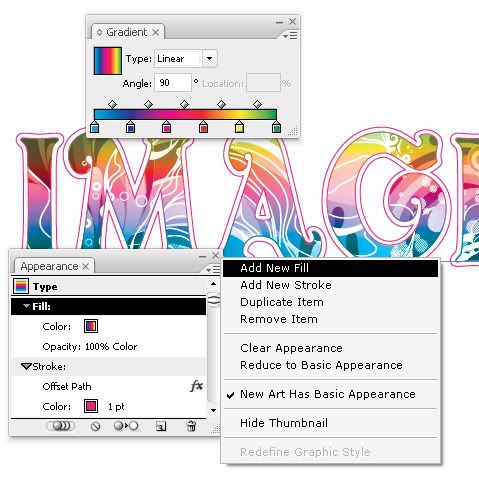
New Fill Color and Blending Mode
In the same way, now we will apply a New Fill to the text and then will apply Blending mode. So again Select the Text and from Appearance Palette, choose New Fill. For the Fill color I used a lil vibrant Gradient Swatch (which you can find from Illustrator's default Swatches named: Spectrum) I adjusted the gradient with Gradient Tool (G). Still keeping the Text selected, I changed the Blending Mode of Gradient to Color. You can access the Blending mode from Transparency Palette (if not already opened find it from, Window > Transparency).
Tip: Try different Gradients or Solid fill colors and Blending Modes cause each blending modes will give different results depending on the image and fill colors you have chosen in Step 2.
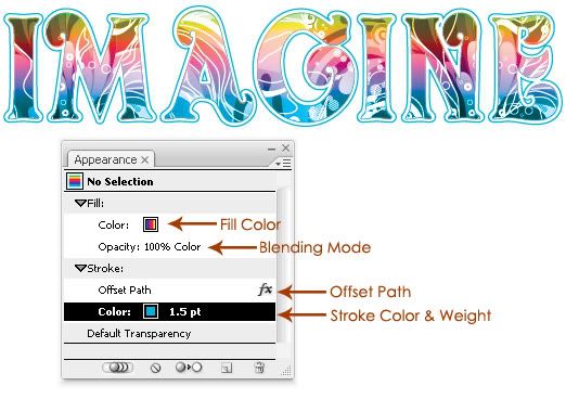
One of the best thing about Illustrator is that, almost everything is editable. In this example at any stage you can change, text, fonts, pattern image, colors, blending mode, stroke weight anything that you want and for that Appearance Palette comes in very handy, it is like....what I would say a mirror? yes maybe because it reflects everything that constitutes a artwork. I am using CS3 but I have heard that in CS4 it has more advanced features, which is great! Here is how my text looks like after I changed stroke colors and weight, you can also see how all the attributes are reflected in Appearance Palette.
Experiment
I tend to do a lot of experiments and in a quick image below, I changed, the text and Fill color just to see how it looks: 
Finally...
Below, you can see my final image, wherein I kept everything same as the image shown above except that I changed the Blending Mode to Multiply, adjusted a bit of Gradient fill, added some swirly vector elements to jazz up the text and added a background color and that's about it! 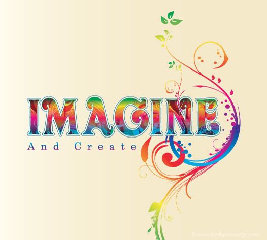
If you have any questions feel free to ask. Hope you enjoyed the tutorial, and of course stay tuned for more! :)


40 comments:
Nice step by step guideline :D
i looove the color effects and how it can change the end result of the text :D just like photoshop
Nice art... Thanks for show.. xD
Att. http://cesar-09.blogspot.com
I like the step by step tutorial, thanx.
I use photoshop, but this design has made me really appreciate illustrator!
Thanks all. :)
Wow, great stuff, just what I was looking for! Happy having found your blog!!!
Thanks Carina! Glad.:)
Great tutorial :D what font have you used?
Well, the font used is Oliver. :)
I'm trying clip an image based on a text and then add a double stroke.I couldn't do it and searching through Google i came here.I thought i found the solution until i realised you use a vector artwork instead of an image as a fill background.
So, is there a way to do your tutorial with a bitmap image?Or another way in general of using a text as clipping mask and then double stroking it and just keeping the stroke visible?
Thanks
Well, of course you can use a bitmap image instead of vector image, I have already mentioned it in the tutorial.
I have also explained a another way of clipping an image in text, this tutorial. You can apply the double stroke in the same way as mentioned in the above tutorial.
Thanks for answering.I just couldn't add the image to the Swatch Pallette.It wouldn't allow me.
I finally found another way of doing the double stroke i wanted, so i'm ok now.
Cheers.
I love this tutorial. I'm having one problem, though. When I finished the steps and tried to move the text, the pattern swatch fill doesn't move with it. It shifts inside the letters. How do I lock them in place once I like how they are positioned within the text?
@Kenny Clark: Glad you liked the tutorial. :)
The tip to solve your query is very simple: Open your Transform Palette (find it in: Window > Transform), click on the lil drop down menu on right, select "Transform Both" that way when you move your text, the pattern swatch fill will also move with it also it will be locked and moving the text will keep the pattern fill intact, once you like how they are positioned within the text.
Hope that helps. Just let me know if you have any other question with this tutorial. :)
Also, for more on Transforming Pattern, you may like to check this tutorial written by me on Vectordiary.
I Loved this Font.
What the name ?
Great Art!
igor_striker@hotmail.com
Well, the font used is Oliver. :)
Ist ja irre !
Danke
Brilliant tutorial! Thanks so much for sharing this. :)
Thanks folks. :)
~nice^^
~and lovely site^^
Segii
Hey, i love that! How did you do the extra vines and flowers on the side?
Sam
Thank You.
With Illustrator brushes and pen tool :)
How do you get all the different vines and dots to fill with gradient colour as if they're one object, rather than fill each one with it's own gradient?
Good question & observation. :)
Well, after creating the shape with pen tool or brushes, you have to expand them and group the shape, so that they are one object. After that, apply the gradient & adjust the gradient with gradient tool.
PS: Would be nice if you had your name in instead of Anonymous. :)
I grouped them and did expand but it still applies the gradient colour to each part, like each leaf has the full gradient for example.
Not letting me post unless I do it as annonymous!
Sam
Sam, you need to expand the shape first and then group them, after that you have to select it (entirely) and apply the gradient. It should not be difficult.
Hi, I love your post. Really informative and fun. I, however, am having one problem with my attempt. I can't figure out how to get the space between the outline of the text and the offset path, to be filled with white so that I can put it on a background and the background doesn't show through the gap around the letter. So I'm getting the letter, then a transparent gap, and then the offset path. Can you help? Thanks so much for taking the time to put this all down for everyone.
Cheers! Bobi
Hello 'The Muse'!
I thought I'd just posted a query here, but it seems to have vanished. ANYWAY! Love your post and appreciate you taking the time to do this for everyone. Very nicely done and such a cool affect with so many possibilities! Thanks :-)
However, my attempt is having one problem that I hope you can hlep me with: the gap between the text and the offset path is transparent and the background is showing through. How do I apply white to the gap so that I can put letters on a black background and the black doesn't show around the letter? Thanks heaps for your help. Bobi
Wow great job all i have to say its superb!
Now I know that there could be more things I could make using illustrator. I like your tutorial I understood it well. Las Vegas Web Design
WORKED PERFECTLY NOW I HAVE ONE MORE ADDED SKILL THANKS
thanks, great tutorial
My image is nt able to drag.. please helpppp...
thankyou
very nice effect. thanks for sharing :)
I have some problem with Adding Strokes or Fill..
Anyway great tutorial :)
I really like the combination of colors can you tell me how we can get the html code according to the color ....
Vertical Jump Bible
very nice blog and effect. WORKED PERFECTLY... Thanks for nice post.
This is very nice tutorial;) I wonder what font did you use?
hello, what font did you use?
Post a Comment
Hello and welcome to Musings! If you like the article you just read you can subscribe here to get updates via RSS or opt to have them sent directly to your inbox.
I appreciate your feedback so please feel free to comment.